Working with games design where they are creating a game in the form of an app. The app is called Dancy Club and is heavily influenced by Crypt of the NecroDancer. A little description of Crypt of the NecroDancer is below along with the trailer to give you the main point of the game and show a little bit of what it is like.
https://www.youtube.com/watch?v=u_avgU1u6yM
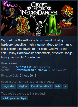
Crypt of the NecroDancer is an addictive game where you improve the more you play and the more you upgrade your items making it a game where you always have something to beat. Personally, a rhythm based game is something I had never experienced before so it was a good first impression. I ended up playing it so much that I ended up having a friend buy the game as well after seeing me play it and enjoy it so much.
It was also a great time to buy at the time because the Steam Summer Sales were on and the game was $3.74 USD when it is usually $14.99 USD. This game gave me a better feeling about working with the group I was working with to make a final product.
In note of working with the games group I found it interesting how fluidly they talked about words that only made sense to them which can be slightly confusing when you are being introduced to a project but it has worked out well so far.
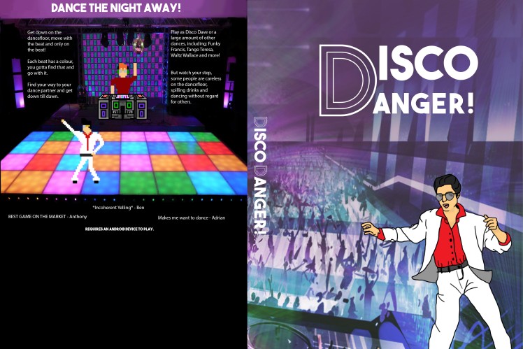
This week the group was presenting a marketing plan where they wanted box art for the game so I created box art for them using the document they had previously started. It was an interesting start to the making of the box art with communication problems arising giving me less time to create the box art but the issues were sorted out and the box art was created.
The document started off as a very basic version of a mockup with incohesive colours and imagery and fonts not relating to the game so I played around with what they originally had and went exploring for better images and fonts.


After playing around with what they had already I began looking at some other box art relating to dance games to get my thoughts flowing and move forward from where I was. I focused on the just dance series and one game that I owned on Xbox 360 called Dance Central 2.


There were a couple of similarities to the boxes. One of the first things I noticed is that majority of dance games have people or characters dancing on the front covers and a lot of games had neon looking colours but in a darker format like a mid to dark toned purple. Any patterns on the box were pretty simple like a group of straight lines leaving the main attention on the dancing people. The characters on any Just Dance box art are very brightly coloured to match how they are in game and I feel as if it is like a trademark piece for their games. All of the games had pretty simple fonts with the most decorative font on any cover being on the Dance Central game where the word dance on the cover had a font with lines inside it following the shape of the letters.
Their document had an xbox box layout on it already but they wanted that to be taken off so I first made the document include it because it was easier to tell the layout and if things on the front cover were even and then at the end I took away the xbox areas and moved the title up so it fit better in the space. When I was creating the box art the animation students had uploaded the 8-bit looking characters to the google drive so I added them into the box art and drew the person on the front cover based from the main character of Disco Dave.
There is only issue I have with the file missing the xbox layout is the fact that the bottom of the back of the box looks incredibly empty at this point in time.


After they presented on Tuesday they found that the name Disco Dave had been taken by an app that came out 3 days prior. So they came up with a new name and I updated the document to match.

One thought on “Studio 2 – Working with Games Design”