Social Media Banners
The social media banners are all very similar. The main thing that changes is the sizing and the spacing between objects within the images.
For instance the more height that is added to the image the less likely there is going to be a lot of images within the space and the words become closer to the only focus.
The opposite happens when there is a larger width and the image has more room for imagery and less room for the blocky logo meaning text is either split up or more images are placed within the space.
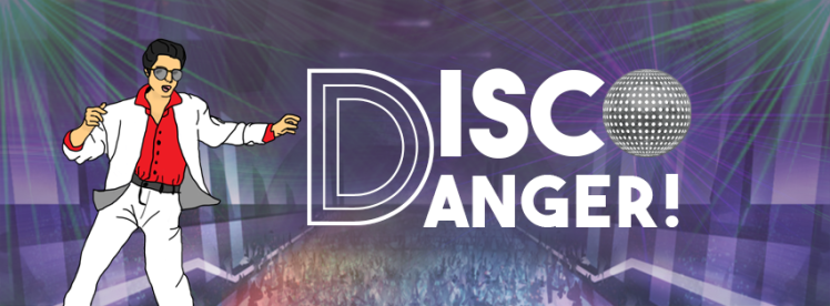
Facebook
851 x 315px
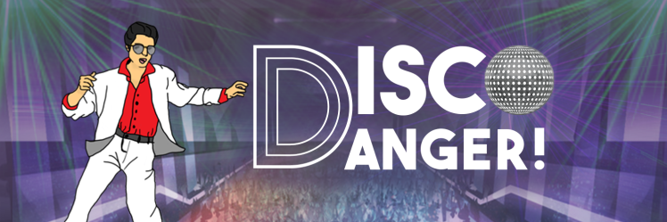
Twitter
1500 x 500px
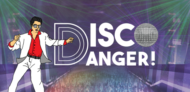
Google Play Store
1024 x 500px
Google Play Store (Andriod)
1280 x 720px
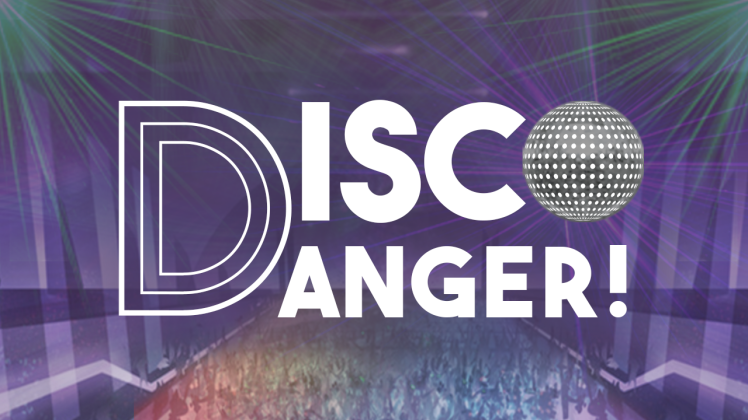
Slide DB
950 x 150px
I decided to make multiple options for the Slide DB banner because on the website it says no text works best but having text on the banner is still an option so I gave them one with text and one without so they can use whichever one they like better.


Social Media Icons
Vary in Sizes.
I decided to make a couple of different versions for the social media icons to give the group options. For each one I kept the background the same and changed the main object within the picture.


Press Kit
Box Art
284 x 190mm
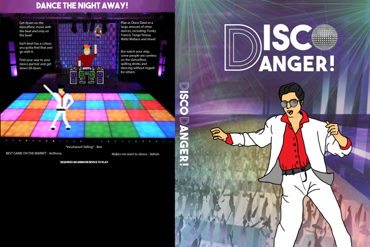
Poster
A3
The poster’s design looks very similar to the box art cover and the first title screen option just varied in size.
(unable to upload)
In-Game Assets
Title Screen & Menu Background
1024 x 600px
I initially gave the group 3 options for a title screen so that they could choose what kind of positioning they liked best and if they just wanted the title screen to just be text based. This also means that the images could be used for multiple things such as a loading page if they ended up using one within the game.
The programmer ended up liking the background of the title screen and asked for the same image without any text to use as the background for menus within the game.
The title screen is one of the only things where the repeating background is not completely symmetrical but as it is more of just a background it doesn’t take away from the eyes unless it is there is nothing on top like text or imagery. When the drawn version of Disco Dave is put on the image it doesn’t matter more so as the character is not symmetrical himself and fills up the the unusual space well.


Buttons
I made 10 numbered buttons for level selection using the main colours of red, yellow, green, purple and pink.


I made two buttons for pricing but these buttons will probably change to put the wording in like the other blank buttons. There is two options with one option having a slight orange edge to mimic a gold bar.


I also made a blank button filled with each colour and gave them to the programmer to put in the words that way.
Timers were also made. The time required to hold 4 numbers so I gave a couple of different timer shapes so they could play around with it and choose whatever shape suited it best.


One thought on “Disco Danger! What is there so far?”