Box Art
A lot of this may be repeated from here, but it does continue on from that blog post as well.
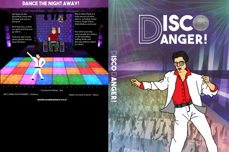
Box art was the first thing I completed for the games group. When I started I was given the images in the starting point and was told to clean it up, make it look less like a mockup and take away the Xbox One template so that is what I did.
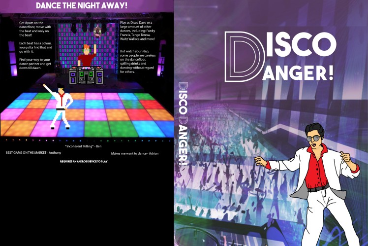
Starting Point


From that point I played around with the images within the document and fixed up little things within the image, took away unnecessary items and played around with new fonts.
I worked with the back image first from that point as I was getting stuck in my design process. So I straightened the image, evened out the amount of text on each side, took away unnecessary items from the grid behind the instruments and the instruments themselves and then changed the colour of it to suit the rest of the box and the colours I was aiming for. Once I was finished with those I changed the dancing character on the dance floor to actually make it a character from the game and added in the dj character as well.
From there I started working on the front cover.
Drafts


I had trouble with the front cover for a while but I ended up flipping the background image of the dj that was in the initial design they had given me so it was no longer there. This helped me a lot as the cover no longer looked like it was supposed to be a game where you were playing as a dj. From there I played around with the colours of the strobe lights and patterned images until they were less distracting.
At that point I needed a way to fill out the empty space so I drew the main character from the back of the cover onto the front in a more realistic way to match the rest of the front cover.
Name Change
The box art was then presented and it was found that the name Disco Dave had been taken a couple of days earlier and it needed to be changed. It was changed to Disco Danger!.
From that point I left it for a bit and started working on other points. Eventually I came back to it and I added the rainbow effect to the dance floor on the front cover. This was done using the paint tool and drawing large painted dots in multiple colours all over the image and then adding a blur to the image and taking the transparency down. Finally, a layer mask was put onto it to match the shape of the dance floor.
I was having issues with the hierarchy of the image and was given feedback to it where it was suggested that I made the character drawing bigger. This helped drastically. After that I played around again with the strobe lights and ended up adding in extra ones that were brighter and more intense.
Finally I played around with the logo and changed the spacing between the two words from a suggestion and then I played around with the O in Disco. I ended up layering an image of an image traced disco ball and the uppercase O in the Disco Diva font that was in the shape of a dotted disco ball. Finally I added purple lights from the disco ball and added a slight purple blur under the letters to make them stand out more.
Final Point
From the Box Art
A lot of the design from the box art went into everything else I did. Which can be seen here: Disco Danger! What is there so far?
There was a difference with the background though where if the image showed a lot of the background I duplicated the side without the DJ so it was more symmetrical and fit the sizes better.
There was also a change with the placement of the text on one of the Slide DB banners to fit the space better where the text was split into two separate words. The Slide DB banners were also the only things where the drawn Disco Dave was duplicated within the image.
The rainbow floor also was not always the same placement on every single thing created.


I also started creating buttons using a tutorial to created 8-bit designs on Illustrator as I had never done like it.
The tutorial I used was this. http://design.tutsplus.com/tutorials/how-to-create-pixel-art-icons-in-adobe-illustrator–cms-22941
With this I created level buttons from 1 to 10 and a blank button shape so that they could be used and the text be added from the programmer which I didn’t know was a thing until I started making the buttons.