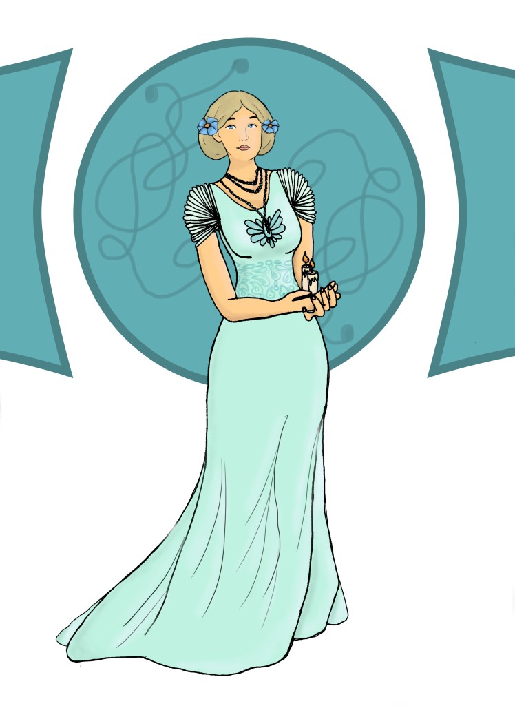
The first piece is based from art nouveau.
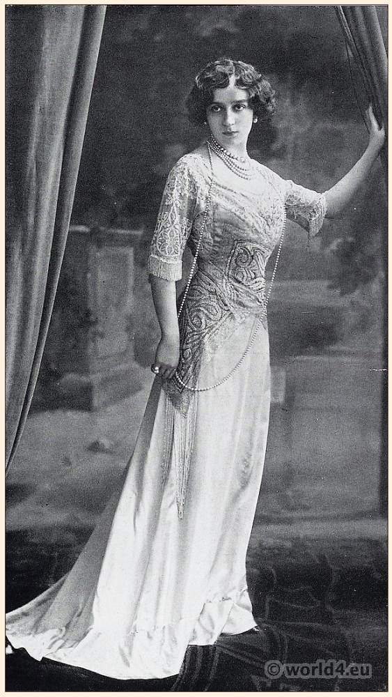
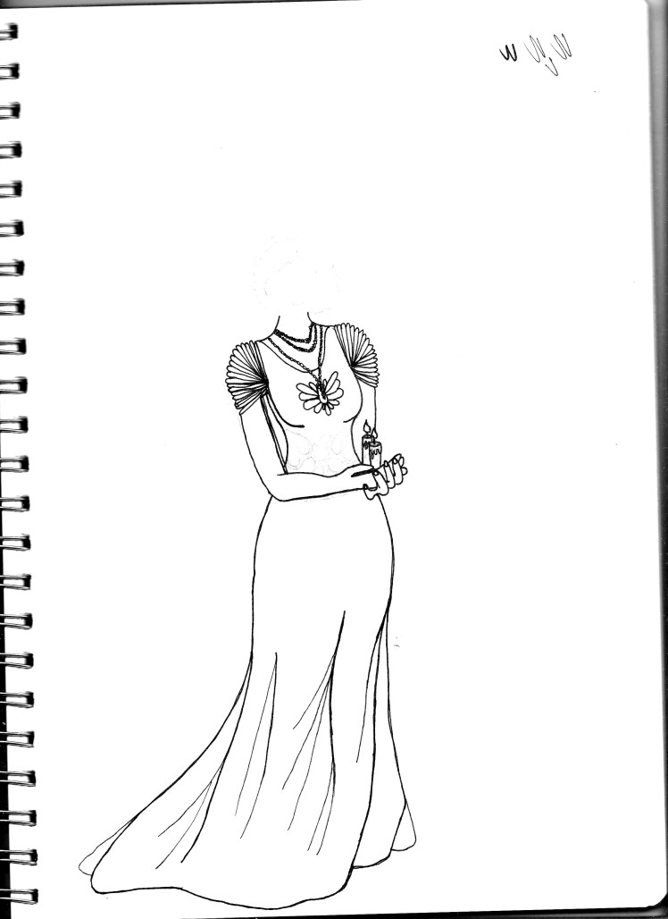
 I wanted to create a lady holding a candle or two so I started basing the image on the left. I liked the position that the woman was standing in and the way the flower was held. My first idea was to copy the pose and replace the flower with a candle but as I started drawing it, it wasn’t working well for me. My first try at drawing the woman I made it too big so I tried to draw it again smaller but it wasn’t working for me and I kept drawing it unproportionately, I also kept getting the part where I had to start drawing clothing and I didn’t want the same thing that the first image was showing and that was when I decided it wasn’t working for me so I tried a different pose and I started looking at art nouveau fashion.


I eventually found this image while looking at art nouveau fashion. I liked the fit and the patterns on the dress so I used it as my first inspiration point.


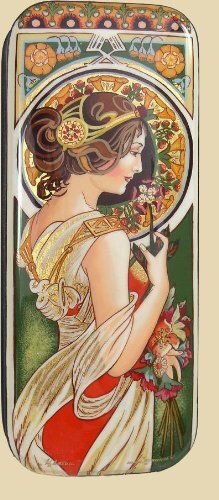
I changed the design slightly with different shoulder and arm pieces. I wanted the clothing to be different than the images I was looking at. I liked the look that the shoulders had on the black and white dress above so I decided on that feel for my final dress design. I also liked the intricate designs in the aqua dress above and mashed the placement of the aqua dress and the pattern that was on the first image and put the jist of the pattern on the drawing where I wanted it.
When I drew this positioning of the body I wanted the woman to hold the candles but I couldn’t find any similar poses to use as a reference for the hands so I took images of my own hands in the position I wanted them in and then I mirrored the image so that it was on the same side that I was drawing the body and worked from there. I’m not going to show the images of myself as I was in my pyjamas as I took the images.
To put it into photoshop I outlined the image with a 0.2 and 0.4 black Artline pens. I didn’t outline the patterns on the dress because it wasn’t very centered to the body’s position so I decided I was going to draw it back in when I made it digital. I also didn’t draw a face on paper as faces are one of my weak points so I decided I would also draw that in digitally so I wouldn’t ruin the paper because of erasing the image a lot.
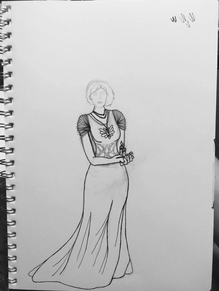
So far I have only done the initial steps in photoshop where I played around with the settings to only show the black outlines I did with the pens although some of the design on the stomach showed through it will be easy to removed for the purpose of continuing.
One I got to that point I added in the face and started colouring in the artwork and adding any details I didn’t put in before.
The final piece is below.
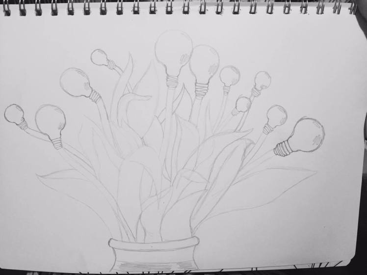
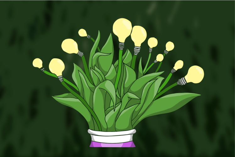
The next idea was to get an image of some sort of group of flowers and turn them into a digital artwork and colour them as I did here. I found I was pretty good with this type of colouring with illustrator so I decided I wanted to make a piece with it. The way that I would relate them to my object of lights and lamps would be by changing the top of the flower to light bulbs. I think it would give it a very abstract type of image.


http://www.markoworld.com/master-appreciators/
https://robertfinkelstein.wordpress.com/quotes-and-images/field-of-flowers/
https://unsplash.com/photos/hLxqYJspAkE
https://unsplash.com/photos/jwWrW6HsKNI
Where the images are from in order from left to right and top to bottom.
I decided to go with the images from unsplash as the images from there are labelled as free high-res images where you can practically do whatever you want with them. So I decided it would be a better idea using them from there. They are also much more softer looking images.
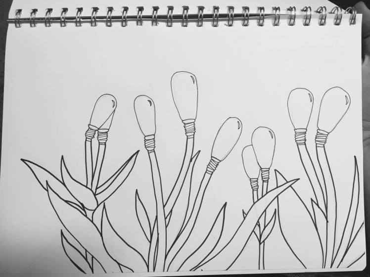
My first stop was to draw the images so that it would be easier to make into digital pieces. I started with drawing the images with pencil and then going over the image with a few black ink pens. I used the 0.6, 0.4 and the 0.2 pens for varying parts of the images. The image on the right used the 0.6 for the stems and leaves which I found to be a little too thick looking for what I wanted so when I went to outline the middle image I used the 0.4 for the stems and the 0.6 for the vase holding the flowers and I think that worked a lot better in the end.
The two images only have the main outlines within the images because any background detail will be done digitally. It makes sure that I keep the main focus of the images to the flowers and work on the lesser parts and keep it in the background.
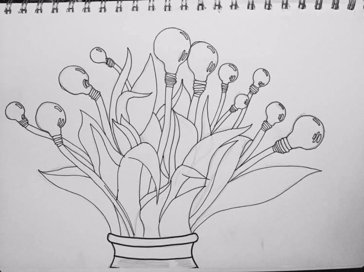
I decided to use the image on the left and put it through illustrator where I image traced it and went from there with the same technique with the colouring as before.
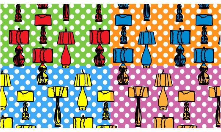
For the last digital piece I tried out was pop art.
For this I found four lamps that were pretty simple in design but still had some personality. I started finding one of each colour, being red, blue, yellow and green but that ultimately didn’t matter in the end because I image traced the images and coloured them to a single colour.


From that point I created the background squares which is where I decided to separate each corner to different colour lamps instead of them all being red. From that point I added in lines to the background to fill the space but it wasn’t looking good so I went with a white polka dot pattern for the background. At that point I added outlines to the images playing around with how thick the outlines were. 2px worked the best for the look I was going for and I kept it at that.