As my object is lights and lamps I’ve been experimenting and trying to create some artworks.
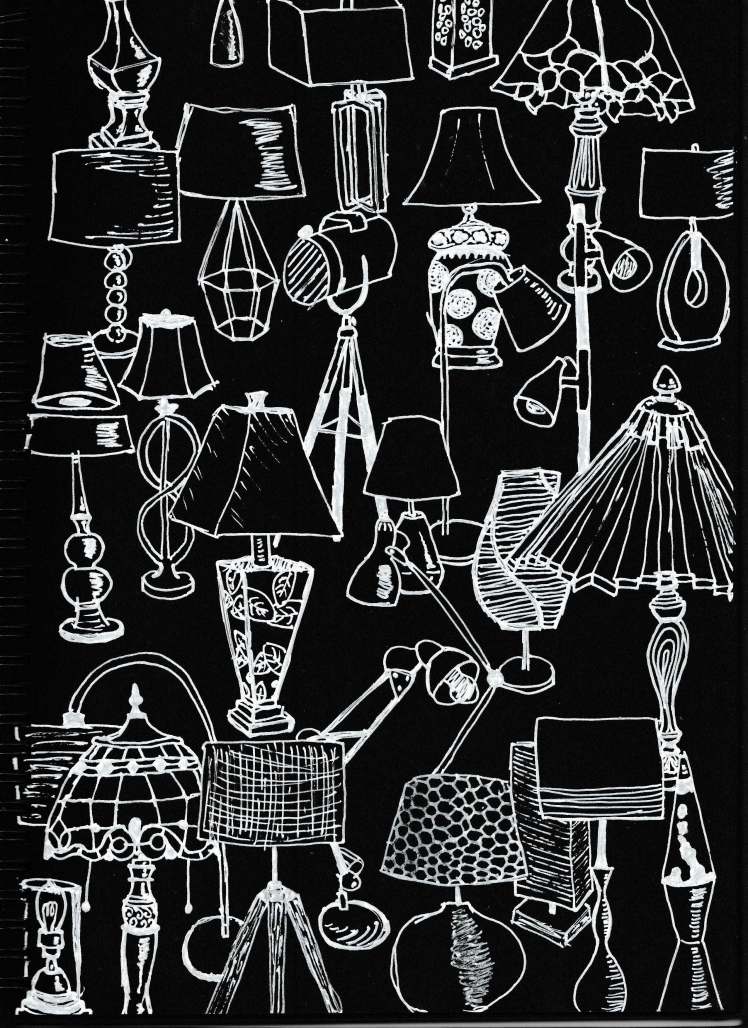
This first image is a white pigment ink on black paper. It was created as a line work piece and has a very organic kind of flow to it with no precise lines.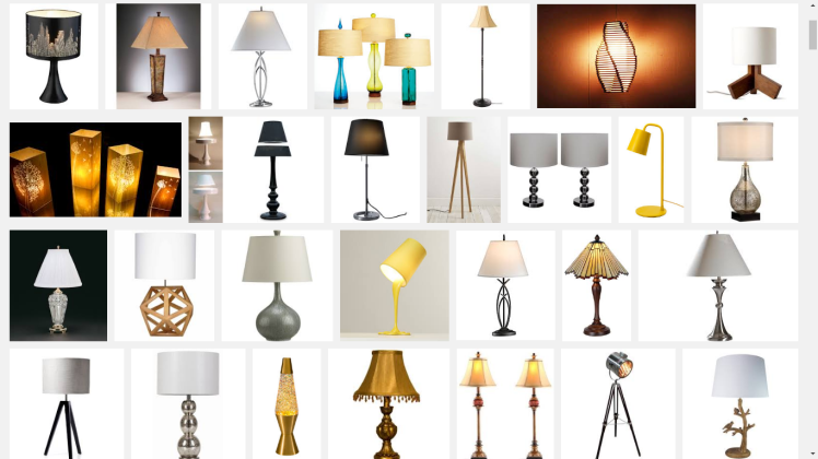
All lamps were found on google images and because of the amount of lamps that there are on the page I’m not going to link them all but here is a screenshot of google images where you can see some of the lamp designs found on the artwork above.


 Light bulb painting is the next one. I used these peel and stick glass paints in ‘white’, ‘dark grey’ and ‘classic red’. I got dark grey because they didn’t have black when I brought them. The colour worked fine regardless and I ended up doubling up the grey to make it darker.
I started looking at hands after seeing this image of a cubist hand.
Finding this hand was the perfect inspiration for what I needed to get painting so I drew out a hand in the position I wanted and then drew it bigger so I could give a kind of mock up of the design I wanted in the hand. I wanted to map it out to see how big I should be making the broken up shapes as I don’t want it to be too spacy and I also don’t want it to be too crowded. In the end I think the spacing worked out well.


Next step was painting the glass bulb. It was difficult because I had never worked with this medium before and I didn’t really know what to expect. I ended up finding that the grey wasn’t dark enough for me so I went over it again which worked. I also used the red colour that I had to draw in the shapes which turned out to be very pink looking and very opaque when all the other colours were transparent. After that was all dry I finally used the white to colour in the nails.
I considered colouring in around the hand but I thought that it would become difficult to see what the actual hand was so I left it at that.


When presenting this I wanted the pattern to show well but the best I could get from the light was lines on the reflecting surface
Main Issues: The design didn’t show onto any surface.. at best it showed a couple of distorted lines.

Last analogue piece was a light house using watercolour pencils. I wanted the light to be the main focus so I made the light be the only thing that exited the kind of cloudy bubble I had created around the image.
The image is based on the Pigeon Point lighthouse in California. I ended up mashing the two images below together to get the right angle, detail and light that I wanted. I think this might have been a bad thing because the image I painted looks as if the light is on during the day but because of the bubble around the image it looks very dreamy looking.


